January Almanac 2021

By Ashley Wahl

Flat lay natural light green snap peas isolated on white background pattern

January cold guides us inward. You find yourself studying your hands, quietly tracing the lines of your palms when, suddenly, there is movement in the periphery. A flash — and then nothing.

The mouse is back. How he gets inside you’ll never know. And yet, the mystery keeps you smiling, keeps you guessing. You catch and release him into the yard

again, and as he scurries off, heart pounding like a tiny hammer, you wait for him to turn around, maybe wink his beady eye as if to say see you ’round.

Here we are again, January. By some miracle we’ve made it. And just like the mouse, we carry with us new stories, new wisdom from our journey.

This is a time for planning and dreaming.

You order seeds.

Next month, when the first of the daffodils burst through the soil in rapturous glory, you’ll sow sugar snaps and snow peas, carrots and parsnips, lettuce and spinach, maybe mustard seeds. But for now, you’re back to quiet contemplation, thoughtfully observing the lines on the back of your hands. The etchings and wrinkles begin to resemble the rings of a tree. There are stories here, you think. Lessons in each tiny groove.

And out of the blue, Aesop’s Fables pops into your mind.

“The Ants & the Grasshopper”: There’s a time for work and a time for play.

“The Crow & the Pitcher”: In a pinch a good use of our wits may help us out.

“The Lion & the Mouse”: A kindness is never wasted.

You think of that crafty house mouse, smiling at his persistence and how you’re not so different from him. Your needs are the same: food, shelter and warmth. No doubt you both dream of the tender kiss of spring. And like the mouse, you, too, rely on a kindly universe to smile upon you, to gently guide you along your journey, granting you stories and wisdom for your future travels.

January is a year of lessons in the making. Notice the creatures, great and small, that remind us how to live. And remember: you are one of them.


Winter Blooms

Nature always gives us what we need. And in the dead of winter, when the bleakness of the landscape nearly becomes too much to bear, she gives us flowers.

Prunus mume, commonly known as flowering apricot, blooms in January. Its delicate, fragrant flowers — pink, red or white — ornament naked branches much like the cherry blossoms of official spring. Amazingly, this small, ornamental fruit tree was virtually unknown in the United States prior to the spirited efforts of the late Dr. J.C. Raulston, beloved horticulturist and founder of the nationally acclaimed arboretum at N.C.S.U. Raulston devoted his life to growing and sharing rare and spectacular plants, P. mume among them. This month, when its vibrant flowers offer their spicy aroma and the promise of spring, surely, whisper, thank you.


Hope smiles from the threshold of the year to come, whispering ‘it will be happier’ . . .

— Alfred Lord Tennyson 


Looking Out, Looking Up

How will your garden grow? Per Aesop’s “Ants & the Grasshopper” fable, now’s a good time to plan ahead. This month, order quality seeds and map out a planting calendar for year-round harvest. Sure, it will take a bit of work. The ants know something about that. But educating yourself on what to plant and when is a game changer. And when you’re harvesting fresh veggies from your backyard spring through winter, no doubt you’ll be singing like a grasshopper in June. 

But while you’re planning, don’t forget to look up. Although a waning gibbous moon will try to outshine it, the Quadrantid meteor shower will peak on Sunday, January 3, from 2 a.m. until dawn. The first new moon of the New Year lands on Wednesday, January 13. Consider this cosmic reset a good time to set intentions and launch into a new project. Through darkness comes light.

Progressively Fresh

How one Greensboro couple went room to room with interior improvements

By Maria Johnson     Photographs by Joey Seawell


Recent retirees Marnie and Jim Fenley wanted a designer’s help with upgrading the two upstairs bathrooms in their Sunset Hills home.

Two bathrooms. That was it.

LOL.

Of course, it’s easy to guffaw now, a year and a half later, considering that most of the couple’s home has been redecorated and everyone is giddy about the outcome.

It happened so naturally, and relatively painlessly, that no one seemed to mind the mission creep, which started, really, with a squirt of envy.

It seems that Marnie’s dear friend, Catherine Harrill, who lives in a Fountain Manor condo (that was featured in this magazine in April 2019) had her digs transformed by the principals at VIVID Interiors, Gina Hicks and Laura Mensch.

Marnie loved the result, and she wanted what Catherine had, only in her own home, with her own stuff and in her own style, which, truth be told, is pretty much Catherine’s style, too.

To wit: Marnie and Jim bought a distinctive turquoise patio chair at The Red Collection consignment shop. Catherine came to visit.

“That’s my chair!” Catherine exclaimed, as if she were laying claim to the curio.

Marnie: “No, it’s not. It’s mine!”

Catherine: “No, I mean I took it to The Red Collection.”

You get the idea.

So Marnie and Jim invited designers Hicks and Mensch — whose names cry out for a Netflix detective series — to their home, a very beige, very boxy, very buttoned-down 1950s residence that’s distinguished on the outside by a Mars-red front door and, come summer, fiery pots of matching geraniums that flare around the magnolia-studded yard inside an iron fence.

Like a splashy tie and pocket square, it’s an exterior ensemble that says, “fun in socially acceptable ways.”

But step inside the home, and whoa Nelly. You’re hit full force by a carnival of colors and styles, a place where funky dances with formal, and prim converses with primitive, and somehow all of those adjectives get along fine.

The profusion of art, especially on the walls, is warm and welcoming to all stripes of expression. The message: Don’t take yourself so seriously.

“See that deer?” says Jim, nodding to a paisley stag’s head over a kitchen door. “I shot it in a fabric store.”

The couple’s playfulness is infectious.

“The first time we went in, we were like, ‘Wow! We want to be like them when we grow up,’” says Gina Hicks. “They have great art and a great spirit, and they definitely have a Bohemian, eclectic style.”

Marnie returns the compliment: “They got us. They completely got us, and they didn’t pressure us.”

But back to “the project.”

Each upstairs bathroom was mid-century small and situated on the main hallway. After the Fenleys’ daughters, Isabel and Jennifer, grew-and-flew the nest, Jim and Marnie used the spaces as his-and-hers dressing rooms; the master bedroom had no en suite plumbing.

By the time they hired VIVID, the Fenleys already had embarked on updating the facilities with new flooring, vanities and tiled showers enclosed by frameless glass.

They wanted help with wallpaper, fixtures, cabinet hardware and lighting.

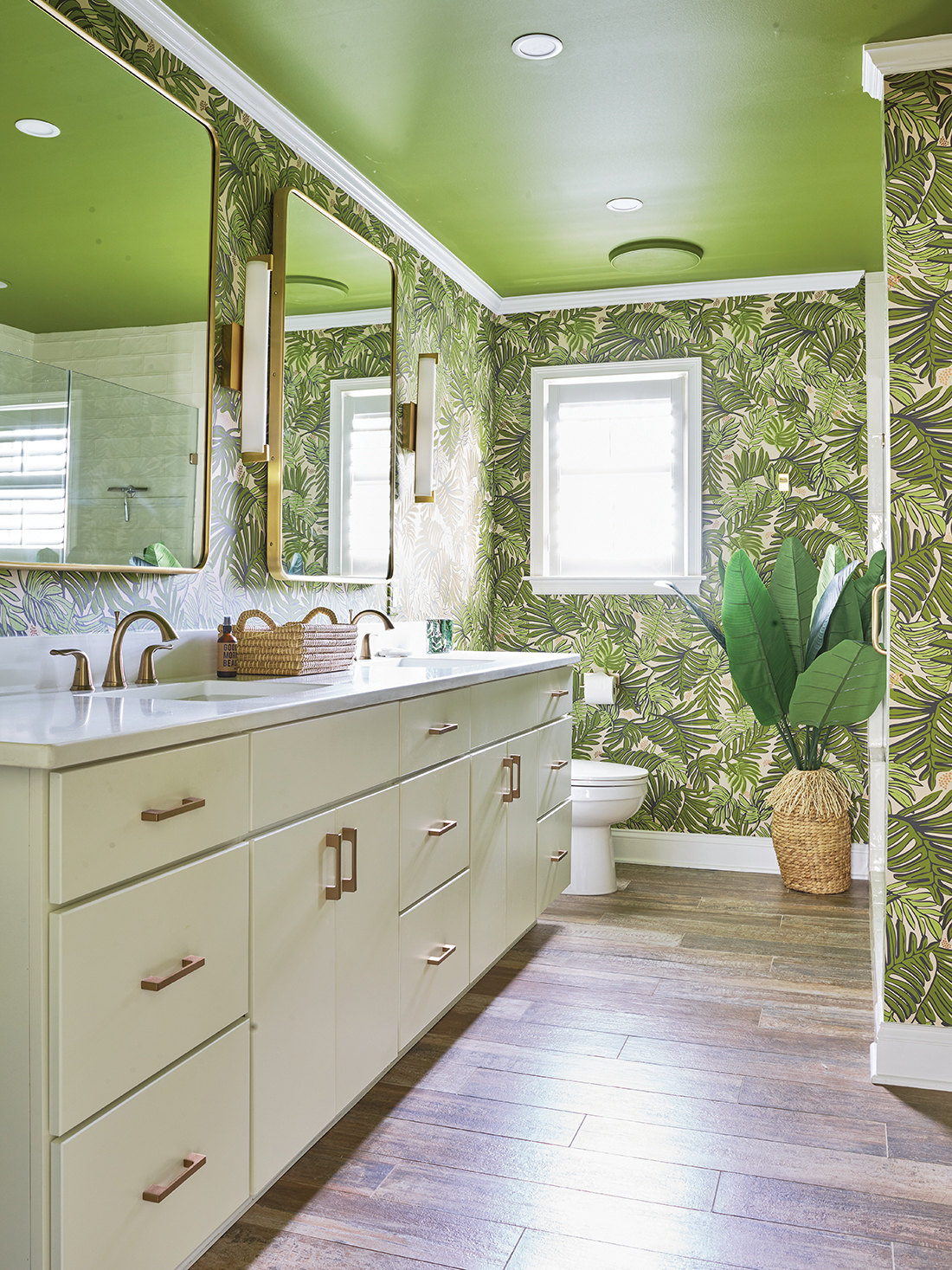
Hicks and Mensch didn’t hold back. For Marnie’s bathroom, they prescribed bold botanical wallpaper (starring split leaf philodendron, a.k.a., Swiss cheese plant, for the flora-driven) and sleek brushed gold fixtures, hardware and lighting. Using computer-assisted design, they rolled the ceiling with avocado paint.

The overall effect: clean and green.

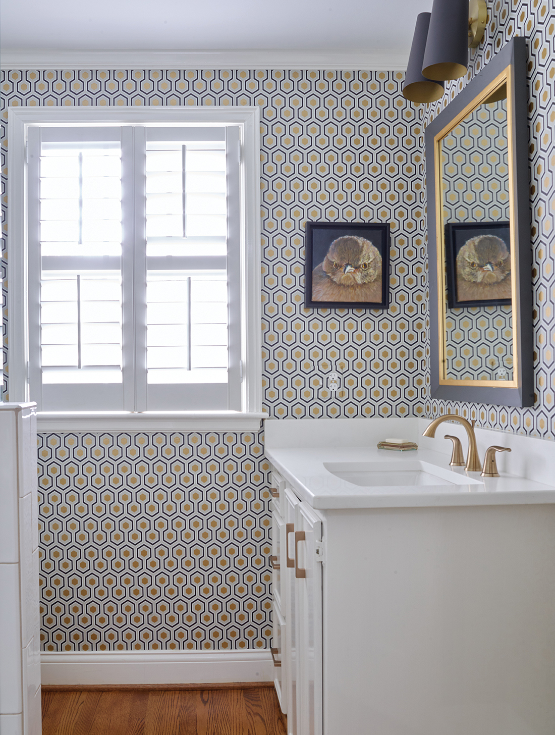
They gave Jim’s space the geometric treatment, covering the walls with black-and-gold-foil hexagonal wallpaper. Lighting, hardware and accents repeated the color scheme.

The Fenleys were thrilled with the fancy baths.

“We felt like we were in a hotel,” says Marnie.

Mission accomplished. Right?

Ahem.

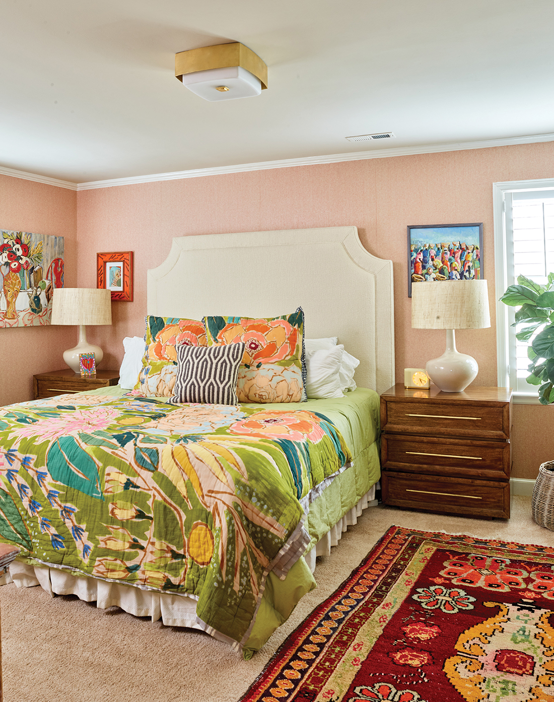
“We decided we wanted something a little different in the bedroom,” says Marnie.

Playing off a riotous batik-style bedspread that Marnie got at Anthropologie, Hicks and Mensch papered over the faux-painted walls with a peach-tinged material that resembles grasscloth but is actually woven from slender tubes of paper.

To dress the bed, they added a tall headboard, covered with nubby, cream-colored fabric, and framed the space with white, teardrop lamps atop new mid-century style nightstands.

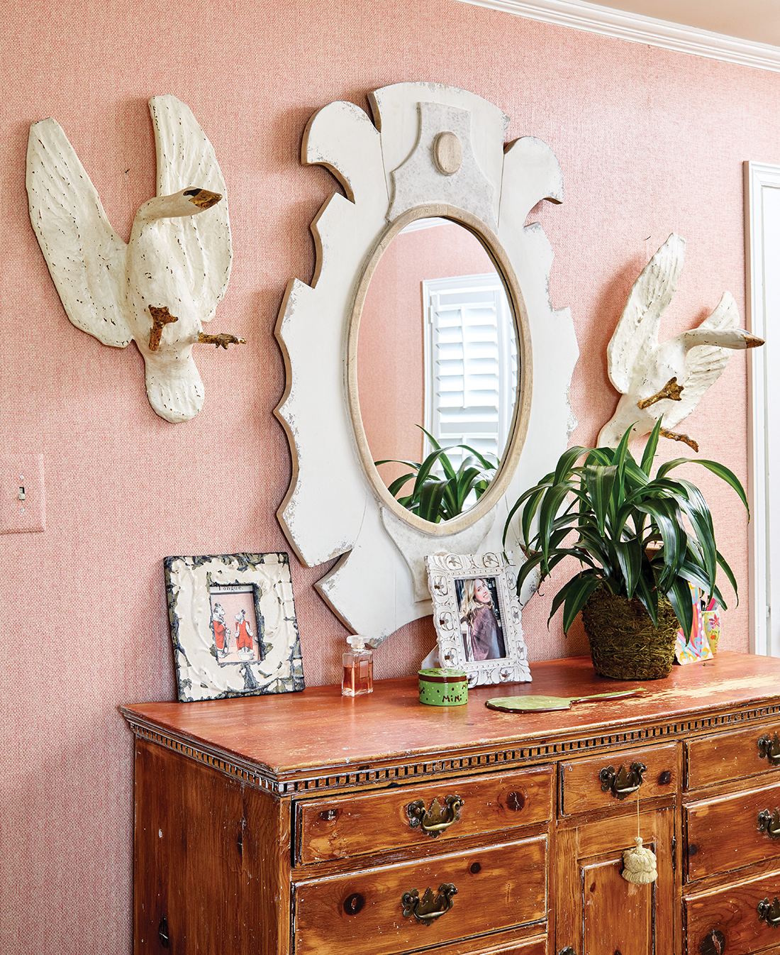
Much to the Fenleys’ delight, the VIVID women incorporated many of the couple’s love-worn pieces: an Oriental rug, an old desk, some green leather chairs, a bureau and dresser, and a remarkable combo clinging to the wall over the dresser: an oval mirror with a frame resembling a white gear cog, and on each side of the looking glass, a white goose that appears to be coming in for a landing, webbed feet outstretched.

“Gina and Laura said, ‘What the hell. They look good. Keep ‘em,’” recalls Marnie, who appreciated the pair’s conservation of furnishings for sentimental and monetary reasons.

Everyone raved about the bedroom.

The Fenleys were done. Yes?

“Fortunately or unfortunately, once you start, it’s hard to stop when you’re trying to perk things up after 35 years,” Marnie explains.

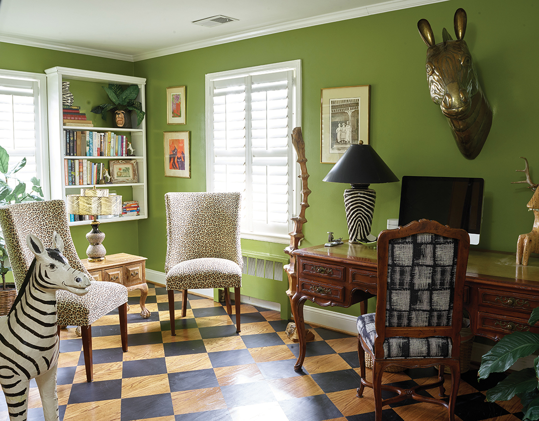
It was true; the upstairs office looked awfully office-y, despite an abbreviated yoga wall complete with metal plates and a padded belt that Marnie and Jim use to stretch their cranky backs.

Marnie demonstrates, using the belt to flip upside down mid-sentence.

“It just feels good,” narrates Jim.

Team VIVID went with the hanging-from-the-trees vibe, tipping the room more toward safari than spreadsheet. For the office walls, they pulled in the same avocado paint used on the ceiling of Marnie’s bathroom. They quite literally dragged down two leopard-print side chairs from the attic. Never mind that the Fenleys’ own tiger, their late orange tabby, a ruffian named Bob, had clawed the upholstery on the back of one chair. The shredded fabric would stay. This was a safari, dammit.

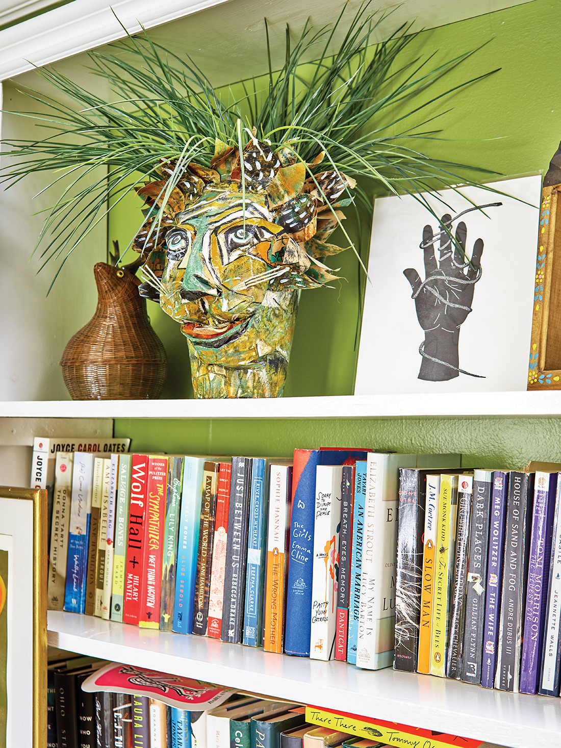
The VIVID gals also brought down a brass and copper burro head that Marnie’Ms mother, Isabel, had bought in Mexico when Marnie’s dad, Jack, went there on textiles business a half-century ago. The zebra-striped lamp on the computer desk would stay. The bookcases would continue to shelter a papier-mâché bear, as well as a crazy cat head crafted by Marnie’s former sister-in-law, Mitzi Fancourt, who gave it as a birthday gift.

“It’s a lion. I’m a Leo,” says Marnie.

Jim, who built the wall-mounted bookcases in the office, reprised another improvement; he repainted the wooden floor with a black checkerboard design he’d brushed on years ago.

“You have to tape, and re-tape and tape again,” he says. “It’s not easy, but it looks good.”

With that, the upstairs was finished.

The End?

“We were like, ‘Well, let’s walk down to the living room,’” says Marnie.

The living room, the Fenleys agreed, needed some attention. But it had great anchors, chiefly a yellow leather sofa that came from Marnie’s mother’s home in Sedgefield. Her mom’s portrait, in profile, hangs across from the tufted sofa. Isabel is a knockout. So is her couch. Visually speaking.

Practically speaking . . .

“It’s the kind of couch you sit on and slide off,” says Marnie.

“We really need to put Velcro on it,” says Jim.

“People do sit on it. It’s just not a place you want to spend a lotta, lotta time,” Marnie explains.

However, the seat makes a great gallery for pillows, one of Marnie’s weaknesses. A shopping trip to High Point’s furniture market netted a fuzzy, blue number that recalls the texture of the Fenleys’ beloved standard poodles.

As counterpoint to the sofa, Jim picked a fuchsia rug, and the couple bagged a cherry-colored wall hanging populated by camels, horses and men in turbans.

They also bought two new club chairs and had them covered with floral fabric in tempo with the room’s bouncy melody of fuchsia, blue and amber.

They calmed the ferment by hanging long, white drapery panels from high-mounted rods, by keeping the sea foam walls, and by extending the cool paint color to the fireplace mantle and surround.

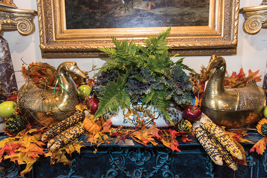
The mantle decorations are pure Fenley: a gilt-trimmed mirror; a bonsai-like vase and branches; and a frilly-framed, acrylic painting depicting a steer skull and owl figure. The painting was made by their New York-based niece, Anna Fancourt, who comes by her artistic chops honestly. Her mother, Mitzi, made the lion head in the upstairs office. Anna’s father, Walter Fancourt — who is Marnie’s brother — is an artist, as well as former co-owner of Liberty Oak restaurant and former chef at Maria’s gourmet deli and catering shop.

“I buy everyone’s artwork in the family,” says Marnie, who expresses her genes in the arrangement of art and in her willingness to take visual chances.

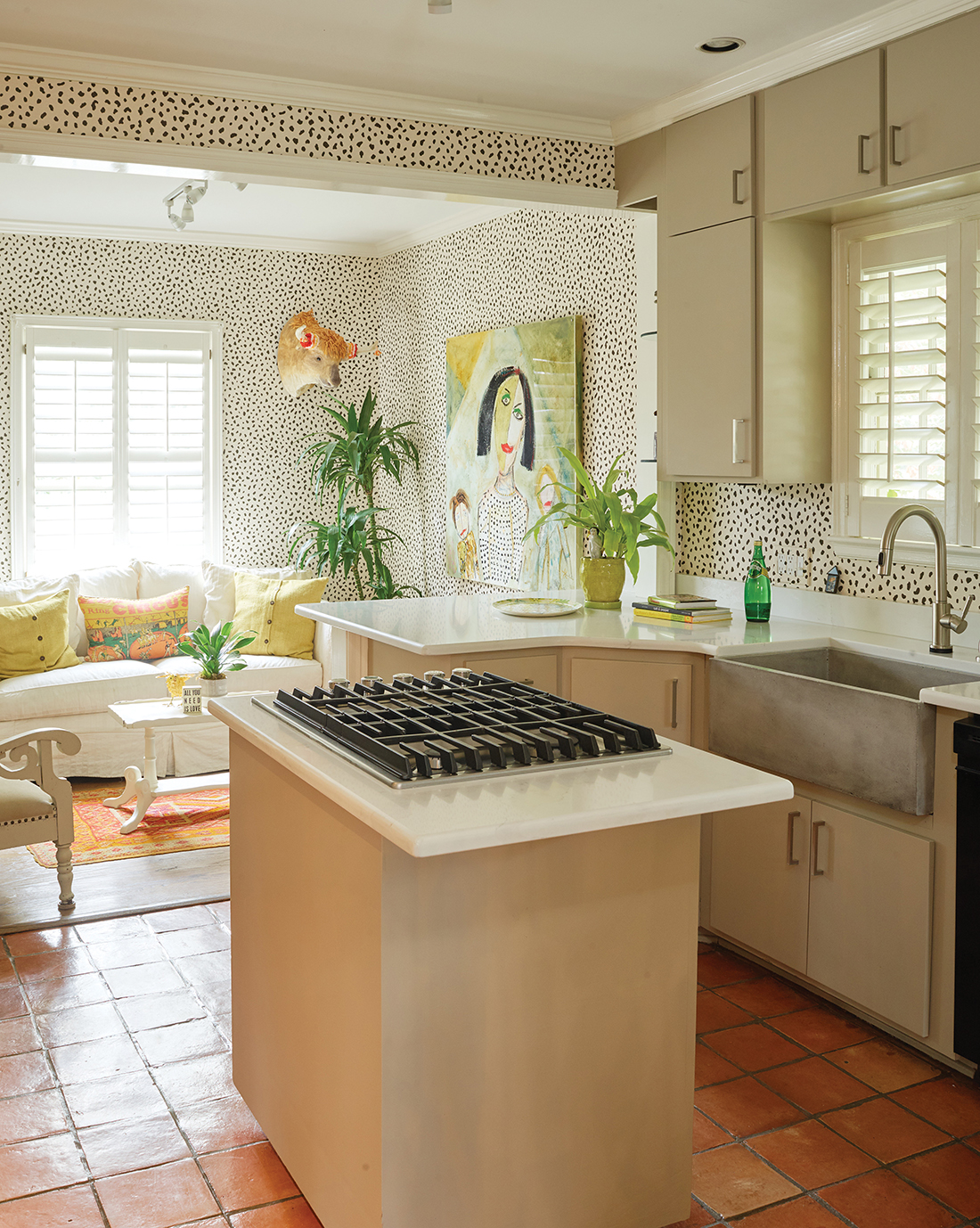
That’s why no one was surprised when she said OK to covering the ceiling of the dining room — did we mention that the VIVID crew moved on to the dining room next? — with a black and white wallpaper that Marnie describes as “Dalmatian spots.”

Neither did it surprise anyone to know that Marnie and Jim — “I just shook my head ‘yes,’” Jim says — allowed the figurative Dalmatian to run off-leash, peppering the walls of the adjoining kitchen and keeping room, a compact living area clipped to the kitchen.

The outbreak of spots seemed to have been pre-ordained, says VIVID’s Hicks. After the wallpaper was up, everyone noticed that the flecks matched the shirt of a woman depicted in a painting in the keeping room. Also, the inky dabs were the reverse image of white flakes in another painting the Fenleys owned: a dog in a snow storm. They brought the dog in from the cold, transplanting him from the home’s main stairwell to the sunny nook.

And then, finally, the Fenleys stopped.

Faked you out.

They did one more room: the den.

“The transformation in this room is probably the greatest,” says Jim.

“It’s where we live,” says Marnie.

The couple replaced their saggy thrones with contemporary swiveling winged chairs and ottomans — all done in plush periwinkle — along with fresh pillows. They ditched dingy grasscloth for walls the color of spicy mustard.

The backdrop highlights treasures acquired over 36 years of marriage: an elaborately carved oak buffet that came from Jim’s great aunt Sally; an epoxy covered, Picasso-like painting that was bought at a Lindley Park art fair and later framed by blue window shutters; a novelty lamp with Japanese figures resembling Kewpie dolls, camped under a telescoping red metal shade.

More unconventional light emanates from an oil painting of a clown looking wistfully toward a blue sky, a gift from the Fenleys’ friend, Dan Stoner.

“Everybody says it’s scary, but I love the colors,” says Marnie.

“He had a fear of clowns, and he was working through it,” says Jim, 72, who understands that healing is a process. In 2015, he retired as clinical director of Fellowship Hall, a drug and alcohol treatment center in Greensboro.

Marnie, also 72, has a background in counseling. And catering. And creating a home from what started — in 1984, when they bought it— as a fairly bare stage on which their lives would play out. Over time, the Fenleys dressed the home with unique sets and props.

“When I think about how it started out, it has morphed and morphed and morphed into something we really love. It’s like we’ve been able to fulfill it,” Marnie says.

“When I look at old photographs, it’s pretty amazing how it’s grown and changed,” Jim adds.

Marnie summarizes: “Jim says he’s dying here. We’re going to stay as long as we possibly can.”

Refreshing their home in stages, expanding the scope and paying as they went — a typical experience, according to designers Hicks and Mensch — was much less daunting than plunging into a complete overhaul from the beginning.

“I think that’s the only way I got it past Jim,” says Marnie, laughing. “Otherwise, it would have been a nonstarter.”

Jim acknowledges this fact with a smile.

Marnie says their daughters prefer more monotone interiors, but granddaughter Jacquelyn values their juicy aesthetic.

“I told her, when your grandfather and grandmother die, you’d better get over here, and get what you want as fast as you can,” says Marnie.  OH

Maria Johnson is a contributing editor of O.Henry. She can be reached at ohenrymaria@gmail.com.


Photographs contributed by Vivid Interiors

What We’re Made Of

While researching her own family narrative, author Shonda Buchanan uncovers pieces of a story that belong to all of us

By Virginia Holman     Photograph by Nathalie Gordon


“Where do you come from?”

This was the question that professor Shonda Buchanan, author of the memoir Black Indian, was asked when she was a child. As she became an adult, the question grew larger. It’s the question she thinks about “when I look at the multitude of shades in my beautiful family, and in America.”

Born in Michigan, Shonda Buchanan’s multiracial heritage was something she always knew about, but only partially. “I’m African American with Native American ancestry, and I identify as Black Indian,” though she also notes that some may use the term Afro-Native.

“My mother often told me that the family was Native American, White and Black. Yet she could never tell me who those Native American members were; she didn’t know the tribes of our ancestors. That information was just gone.”

As Buchanan became aware of the gaps and erasures in her family history, she decided to find out what and who had vanished from the family narrative. When she taught at Hampton University and the College of William & Mary, she began researching her heritage. Eventually, she was able to trace her ancestors’ journey from Eastern North Carolina (Sampson County) to Virginia, and then into Indiana and Michigan.

Buchanan says that even though she did a lot of archival research, she doesn’t consider herself a historian.

“I consider myself a storyteller,” she offers. “I’ve spent a lot of time not just in libraries but also talking with people and unearthing these stories.”

Her goal as a storyteller has been to make sense of her family’s oral history, genealogy and DNA-based ancestry.

Some of the family stories she recounts in her memoir are complicated and painful. There are accounts of violence, discrimination and self-loathing. But there are also stories of joy and awakening, of a girl who grows up and into an artist who is able to tell a complicated family history. “My family lost language, lost culture, lost ancestors’ names,” Buchanan says, some of which can never be recovered.

Even so, what she did discover has led her to honor and celebrate traditions that lay outside of her upbringing, if not outside of her blood. And as Buchanan learned more about her ancestors, she began participating in Native American customs in order to more fully understand this part of her heritage. It’s been a challenging journey. Here she treads respectfully but never shies away from issues of origins, race and identity in America. In essence, she asks again and again, “Who am I? Who are you? Who are we?” As she dances in powwows and visits sweat lodges to connect to this part of her ancestry, she finds she always asks herself, “Am I doing it right?”

Buchanan’s memoir also delves into some of the ugly policies that shaped how people were classified in the United States, in particular the legacy of Walter Plecker, whose views on race resulted in “one-drop” policies and antimiscegenation laws that outlawed interracial marriage. These policies, she writes, are part of the reason her family history vanished — even as she and her family flourished and grew. “I was a cartography lesson,” she writes. “I was the geography of the intersection of enslaved Africans, Eastern shore American Indians, indentured White servants; their journey was on my face. I was the seed of a memory my grandparents wanted to erase.”

Buchanan’s story resonates because of her willingness to engage in historical reckoning, her struggle with her painful family history and her desire to claim her whole self publicly. At one of her first sweat lodge experiences, she sings a West African song and then a Native American song to honor both of those parts of her identity. This is the story’s strength — whether Buchanan is at a sweat lodge or powwow, at the “door of no return” in Senegal or on the doorstep of her relative’s home — it is the author’s openness and willingness to work and struggle toward a greater understanding of identity, of humanity.

She says that her memoir’s true purpose is instructive. “I’m always asking myself: How can I talk to people about this? How can I educate?” Writing Black Indian has allowed her to uncover traditions and culture that her family lost. The book, like its author, defies easy categorization, which is to say that it achieves what the author envisioned, “to show that the stories I grew up with, the stories I uncovered, are part of the rich tapestry of America.”

After all, she says, quoting the author James Baldwin, “We are trapped in history and history is trapped in us.”

Learn more about Shonda Buchanan and Black Indian at
shondabuchanan.com. 
OH

Author and creative writing instructor Virginia Holman lives and writes in Carolina Beach.

The Memory Keeper

A photographer’s journey through cameras

Story & Photographs by Mark Wagoner


Photographer Mark Wagoner’s origin story is one of seduction. In the early 1960s, when Mark was 4 or 5 years old, his older brother kept a darkroom in the basement of their home in Reidsville. The mystery of what went on behind that door ignited a curiosity within him that developed into full-blown obsession. He wanted in on the secret, the alchemy, the magic. Hence, as soon as his father would let him hold the family’s Kodak Brownie, Wagoner began exploring life through the lens of a camera and never stopped. A career photographer for over four decades, Wagoner has maintained an assemblage of cameras that rivals a Kardashian shoe closet. And as he’s pared them down, the process has revealed a trove of sacred memories. Imagine rock legend Bob Weir handling his most precious guitars, recalling where he played them, who was with him, what he loves about their shapes and sounds. Wagoner blushes at the comparison but admits that the sentiment he feels is apt: “I feel an emotional attachment when I hold these cameras,” he says, “but whether it’s an external energy or an energy that the object inspires, I can’t say.” Here, in his own words, are the memories that each of his cameras evokes. 

– Ashley Wahl


Brownie

This is the camera that belonged to my family when I was a child. I used to try and take “serious” photos with it, like portraits of my family and photographs of trees. Recently, while looking back at some of these old pictures, I could trace a fairly straight line from where I am now to who I was then as a photographer. One such photo is of a park sign on a snowy playground. Look closer and see that the sign has been pelted by snowballs. This glimpse into my younger self reveals my earliest exploration of visual jokes and play, which have long fascinated me.


Graphlex

When I was on the Yearbook staff at Reidsville Senior High from 1972 until 1975, we spent so much time in the darkroom that we had our own key to the school. This old press camera was given to me by my high school principal. It belonged to the school and had essentially been collecting dust since the 1950s. Since it shot a weird film size that wasn’t readily available — 3.25 x 4.25 — I would take 4 x 5 film into the darkroom and cut it down with a paper cutter. I used this Graphlex in high school and college until I had my own view camera, but I continued using this lens for years.


Diana

I was 10 years old when my parents gave me my very first camera. We were driving to Elks Camp for Boys in Western North Carolina, so of course I brought it with me. During those two full weeks at camp, I probably shot one roll of film — that’s it. But when you put a bunch of 10-year-old boys in a cabin together, you end up learning lots of different things.


Dad’s Voightlander

This camera is particularly special to me and always has been. It was purchased by my father, Raymond Wagoner — in Italy, I think — during WWII. I still have a lot of the pictures he took with it when he was in Europe. Pictures of the guys clowning around in their uniforms; one image of them posing beside a bombed-out Jeep.


Canon F-1

When I was in college, most people had Nikons. But I was drawn to Canons. After taking basic photo classes with my $12 Yashica, my dad bought me this Canon in 1976 — my first professional camera. The F-1 was my main 35mm camera for probably 20 years. I’ve taken them all over the world, including the Great Wall of China.


C500

For years, this classic Hasselblad was the camera of choice for many professionals. I used one at multiple jobs throughout my career, including an 18-month assignment in Saudi Arabia in my 20s that opened up my world. I wound up with a digital version around 2010.


Kodak Brownie 8mm Movie Camera

Yep, this was the family camera I used to shoot my very first movies. Things like my brother on his mini bike, jumping over obstacles. I’m lying on the ground, of course, looking for the most dramatic camera angle I can find. 


Polaroid SX-70

In the early 1980s, when I lived in Saudi Arabia on an assignment with The Parsons Company, an engineering firm from California, the photo department had access to what was essentially an unlimited supply of film for it, likely from some kind of restocking blunder. Everyone in the photo department bought one of these cameras. We must have taken thousands of photos with them. Imagine . . . a bunch of bored, fairly youngish guys with nothing to do. I mean, thousands of photos. I kept a collection of the best of the best: pictures from our scuba diving excursions, our drives through the desert, dudes in shorts smoking chicken on the patio. 


The Blank Canvas

Three local artists share their radiant visions of hope for the New Year

By Ashley Wahl     Photographs by Bert VanderVeen


Our thoughts create our reality.   

Mystics and writers have long explored this simple yet radical notion, borrowing wisdom from nearly every ancient culture.

I’d like to think there’s some truth to it.

From the late 1930s until his death in 1972, New Thought philosopher Neville Goddard taught that imagination and faith are the secrets of creation. “Be careful of your moods and feelings,” he wrote, “for there is an unbroken connection between your feelings and your visible world.”

In the late ’70s, New Age author Shakti Gawain said as much in her bestselling book Creative Visualization, defining imagination as “the creative energy of the universe.”

Oprah brought this metaphysical concept to the masses in 2006 when she plugged The Secret on her show, praising Rhonda Byrne’s “life-changing” book and documentary film for bringing to light the Law of Attraction, aka the spiritual principle that like attracts like.

“Quantum physicists tell us that the entire Universe emerged from thought,” writes Byrne.

Although critics have rejected this claim, arguing that “the secret” has no scientific foundation, it certainly has a following.

Perhaps it’s difficult to certify that our thoughts hold the power to change our world, but consider the studies conducted by Japanese researcher Masaru Emoto, who claimed that our consciousness could alter the molecular structure of water and had the photos to prove it.

Human beings are largely made of water.

Ditto Planet Earth.

And so, if only for the sake of our own pleasure, let us imagine that this maxim holds true — that our thoughts and intentions can change us and therefore our reality.

In this spirit of optimism and imagination, O.Henry’s editors began looking at 2021 as a literal blank canvas, asking ourselves how we might wish to see it — what colors and textures we might add, and what space we might leave for positive changes.   

Then, just for fun, we reached out to three wildly talented local artists — Krystal Hart, Jessica Yelverton and Beka Butts — to see if they might play along, sharing with us their very real, deeply heartfelt “visions of hope” for the new year.

You might treat this as a dream board kind of rendering, we suggested. A vision you might create in a spacious morning.

The artists floored us with three refreshing and exclusive visual responses, which they graciously agreed to share in the pages of O.Henry.

We hope that their art might inspire you, dear reader. And if this new year looks or feels anything like their visions — soft, dreamy and full of hope — then things are looking up.


Krystal Hart

Krystal Hart is a North Carolina native whose work bridges cultures and communities by exploring our shared human condition. Her mission is to shift perspectives toward restoration and regeneration. Through abstraction, Hart navigates boundaries and space within the human experience. She communicates through painting, collage, audio and moving image. Inspired by Nihonga, an early 20th century style of traditional Japanese painting, Hart uses precious natural and synthetic materials that are subjected to trauma. These works of art express emotive color fields that balance tumult with delicacy.

Artist’s Statement: The green and blue hues in my vision invoke feelings of new life and fresh perspectives. The dark shapes represent the recent past: systems and situations that we are still trying to make sense of. And the bright pops of color and geometric shapes remind me of a child’s building blocks — symbols of hope for a bold and playful reality that we are all invited to co-create. Imagine in 2021 not taking ourselves — or even our recent past — too seriously. Imagine assuming a jovial attitude, regardless of circumstances. Imagine our wonder for goodness and beauty restored. I see thoughtful, honest and careful steps forward. May our reflections looking back at 2020 lead us to surprising innovation and new ways of seeing and being. May we be more careful with ourselves and others — more kind. May we seek and discover the loveliness within each moment. And may we be confident, sober and courageous in our thoughts and actions. 

Media: Natural minerals, pigments, white charcoal, graphite powder, sumi and walnut ink, silver leaf, tulle, cheese cloth, colored pencil, twine fibers and mitsumata paper on kumohadamashi paper mounted on wood panel, 30 x 40 inches

Read more about Krystal Hart in the Winter 2020 issue of Seasons Style + Design and at her website, www.krystalhart.com.

Essentially, Child’s Play. 2021


Jessica Yelverton

Jessica Yelverton, aka HighBrow Hippie, is a Greensboro artist who draws inspiration straight from nature and translates it into landscapes, seascapes and botanically-themed paintings, primarily in watercolor. Endlessly fascinated by the juxtaposition of control and chaos that watercolor allows, Yelverton describes the creative process of setting pigment free as one of her favorite phenomena on the planet. Watercolor, the artist says, demonstrates thoughtfulness, grace, graciousness and trust — all the traits she hopes to reflect through her life and artwork. 

Artist’s statement: Several months ago, I learned somewhere — probably on a podcast — that plants communicate with one another. They do this through intricate root systems underground; partially their own, partially with help from the threadlike roots of fungi. This seemed almost unbelievable to me — plants and mushrooms as conscious entities! But they do indeed talk, and not only to their own kind, but across species. Plants communicate about everything from nutrients to water levels, from sunlight to pest protection. They also share resources with one another. If a tree in the forest is attacked by a predator, for example, information spreads beneath the forest floor. Defenses are put into place, and nutrients from surrounding trees flow to aid the one in need. What if we take our cue from plants as we enter 2021? What if we recognize that we don’t have to be homogenous in our thinking to successfully communicate and support one another? We are varied, yes, but what if we saw our differences as our collective strength? No one wants a forest or a garden with only one species. Variety is what makes life together beautiful. Communication is what makes it work.

Media: Pencil and watercolor on paper, 12 x 12 inches

Read more about Jessica Yelverton in the Winter 2020 issue of Seasons Style + Design and at her website, www.highbrowhippiestudio.com.

Varied, Rooted & Whole, 2021


Beka Butts

Beka Butts is a Greensboro illustrator, artist and maker dedicated to contributing to the growth and vibrancy of the Triad’s art scene. Born on the Border in El Paso, Texas, Butts explores social issues through a lens of Hispanic folk art and defines her work as a mix of Chicano and Southern influences. Drawing inspiration from nature, the artist employs intricate patterns and detail while creating everything from large-scale murals to tiny works of wood-burned jewelry.

Artist’s Statement: What do I see — and hope for — in 2021? People taking care of each other. To me, this means supporting local restaurants, artists and makers who are struggling, tipping generously, buying handmade, wearing masks, being kind to others and ourselves, being as safe as possible, and being conscious of every healthcare worker who keeps showing up, day after day, throughout this pandemic. I want to see us taking care of our teachers and the parents who have become teachers, too. Let us take care of our community, especially those who are most vulnerable. Keep checking on our family and friends. Send the text message, the video, the letter, the gift — let’s remind each other that we’re not alone.

Find Beka Butts’ handmade jewelry at the locally curated Hudson’s Hill in Greensboro and explore more of her artwork on social media @Bbutts_illustration or facebook.com/BekaButtsIllustrator.

We Take Care of Each Other, 2021


The Light Within

In darkness, Beverly McIver sees and paints by the light and voice of truth — and amazing grace

By Jim Moriarty


When I was much younger and more rambunctious my mother used to caution me that nothing good ever happens after midnight. My mother never knew Beverly McIver.

Working into the solitary small hours of the night, McIver often begins a canvas by projecting a face onto it. She underlines the eyes, the nose, the mouth, getting the drawing to her liking as if she were setting a table with the bare essentials before the feast. Then, when the light goes out, the paint goes on. And, oh my, does she paint. With a kaleidoscopic palette and audacious, yet economical, brush strokes, she steps into her subject — often not once, but over and over again, creating in the sweep of time a riveting series of canvases. Works can be built around a doll or a coil of black rope. They can be portraits of her mentally disabled sister, Renee, her father, Cardrew Davis, or even herself.

“The fact that she works in series is such a strength. And what I’m so moved by is the freshness, the fluency,” says Anne Brennan, the executive director of the Cameron Art Museum in Wilmington, North Carolina. “She must have a pact with herself about keeping it moving, keeping it fresh and not second-guessing. And, boy, she knows when to step back, when to get out. I think she trusts her intuition or subconscious. She’s paying attention. That is so brave. So brave and true to herself.”  The Cameron is one of several museums  — including the Mint Museum, the Crocker Art Museum, the Nasher Museum Art, the North Carolina Museum of Art, the Baltimore Museum of Art and the Scottsdale Museum of Contemporary Art — that hold McIver’s work in their permanent collections.

“Imagine if you were painting a series of self-portraits,” says Brennan. “Think how you might become formulaic in your choice of the passage of light against this plane of your face — and she is so not. Every painting is as fresh and innovative and original and spontaneous as the next.”

McIver’s magnetic laugh and her purring Persian cats — Clydie, Bona, Bella and Gracie — roam freely in her Hillsborough condo in the daytime. But, at night, she pays attention to the voice in her head. “They talk about artists needing natural light but when I’m painting I like for it to be dark,” says McIver, whose dreadlocks have fallen victim to a bit of pandemic-induced self-barbering.

“It’s quiet. My brain cuts on. That’s my authentic self. That’s the voice that I have no control over but to listen to it because it’s always right, even if I don’t really understand. My teacher in college said, ‘Just keep doing it. Don’t worry about what it is. Just keep walking.’ I said, ‘I don’t know what to do next.’  She’s like, ‘Just go there and wait for that voice. It’ll show up.’ I’ve always let that govern what comes out. It’s always way, way honest. Painfully honest.”

McIver grew up in Morningside Homes, barracks-style public housing a couple of miles east of downtown Greensboro, long since razed. It was the site of the 1979 “Greensboro Massacre” when members of the Klu Klux Klan and the American Nazi Party exchanged gunfire with protesters organized by the Communist Workers’ Party who had come to Greensboro in support of the region’s predominantly black textile workers. The “Death to the Klan” march was supposed to go all the way to city hall but the two groups clashed at the beginning of the march. Both sides exchanged gunfire. Five people were killed, four members of the CWP and Dr. Michael Nathan, the chief of pediatrics at Lincoln Community Health Center in Durham. The violent confrontation was captured on video, a slice of  ‘70s history that plays on an eternal YouTube loop. McIver’s mother, Ethel, watched the shooting from her kitchen window. The family car, a lime-green Pinto, was shot in the gas cap, the bullet passing into the trunk. Ethel McIver testified at the trial of six members of the Klan, five charged with murder. All were acquitted. Beverly was 17. Though she was not a witness that Saturday morning — “I was working at McDonald’s on Battleground Avenue,” she says — she keeps a copy of her mother’s testimony.

The man who lent McIver her surname is barely a footnote in her life. “I have some tiny, tiny flashbacks of him putting us [Renee, the eldest, Roni, the middle sister, and Beverly, the baby] in a hot tub of water,” she says. “We were all crying because it was too hot. But that’s it.” He was gone by the time she was 3. When he passed away in New Jersey a decade or more later, the McIver family didn’t attend the funeral. A child of desegregation, Beverly was bussed across town to predominantly white schools. “In order just to exist I had to learn to straddle both of those worlds,” she says. One of the coping mechanisms she found was a clowning club at Grimsley High School. “As a clown,” McIver once told Kim Curry-Evans, now the director for Scottsdale Public Art in Arizona, “I was transformed, and in many ways more acceptable to society. No one cared that I was black or poor.” It was the seed of a theme featuring both whiteface and blackface that inhabits many of her canvases, particularly in her early works.

“I needed to not repeat living in the projects and being poor,” McIver says. “Whatever I do, I’m not interested in being poor again.” Her inner voice got louder when she squeezed her first tube of oil paint as an undergraduate at North Carolina Central University. “I had a great teacher who said to me, ‘You know, you have enough talent that if you work hard, you can make it.’ That’s all I needed to hear. I can make it.” The teacher’s name was Elizabeth “Libby” Lentz. She passed away in 2003. “I was in New York and got a call saying she’d driven up into the woods of North Carolina and left her car running and ran a hose from the exhaust into the car and the police had found her,” McIver says. “I flew back down to attend her service. It was horrible. It was really, really horrible. She was one of the first people that really believed in me, that I could have a voice to make a difference in the world. She was a painter and she taught me to paint. So, yeah, that was pretty sad.”

McIver’s degree from North Carolina Central was followed by a Master of Fine Arts from Penn State University and enough residencies, exhibitions (solo and group) and awards to make the curriculum vitae Hall of Fame. She’s held teaching positions at Arizona State University, NCCU and, for the last six years, Duke University. Though she’s set up her easel in places as disparate as an art colony in Saratoga Springs, New York, a studio in Brooklyn or an academy in Rome, her subjects are inevitably close to home.

McIver began painting her mentally disabled and epileptic older sister, Renee, 25 years ago and has never stopped. “I can paint Renee over and over again because she looks different. She looks like a little girl; she looks like she’s 70. Sometimes she looks fragile, like she’ll fall over. Renee is 60 now but has the mindset of a third grader,” says McIver. They talk on the phone every day. “I just ordered Renee a purple comforter. I saw her yesterday. She called me this morning. I said, ‘Renee, don’t call me before 11 o’clock.’ She called me at 10:15. I listened to the message. ‘Hey, I want you to know I really enjoyed that quiche you brought me yesterday. It was so good I ate two pieces this morning. I just wanted to let you know. I know you’re busy. I’m busy, too. I’m making potholders.’”

In 2002 when McIver was a Radcliffe Fellow at Harvard University, filmmaker Jeanne Jordan was a fellow at the same time — a fellow fellow, one supposes. “We were like across the hall from each other,” says McIver. One day Jordan told McIver that she and her husband, Steven Ascher, wanted to make a film about her. The result was the Emmy-nominated film Raising Renee. The initial idea for the project was to focus on McIver, her life and her art. But when her mother, Ethel McIver, was diagnosed with pancreatic cancer, “that changed everything,” says Beverly.

Ethel McMaster McIver grew up in Staley, North Carolina, near Liberty. “I think they went to Asheboro to shop at the Walmart,” says McIver. Ethel began cleaning houses when she was 10 years old, substituting for her mother one day when Beverly’s grandmother was too sick to go herself. Closeted in the Morningside Homes, it was a trade that lasted a lifetime. “When I got my first house I copied the furniture, all the things that were in one of the houses my mother cleaned, winged-back chairs and drop-leaf tables,” says Beverly. When Ethel passed away in March of 2004, Beverly became Renee’s primary caregiver. The film, six years in the making, began before Ethel’s death and ends when Renee is able to move into her own apartment. It tracks — in an unvarnished, authentic way — the complicated relationship between the artist and the sister who knits potholders by the bushel and is eternally enamored of the pinks and purples of a third grader. “I’m not going to pretend like it was easy or that I’m honored to be Renee’s legal guardian,” says Beverly. “I love Renee dearly but some people wanted a film more like glorifying caretaking in a way that’s just not true. Caretaking is hard. I don’t care who it is.”

One of the works McIver painted during that period was Family Praying, a powerful image of five family members, holding hands around the hospital bed of their deceased mother, their own flesh whitened to the point where some features disappear completely. “They are in mourning, sort of life draining away, the way color might drain from someone’s face,” says Jennifer Dasal, the curator of Modern and Contemporary Art at the North Carolina Museum of Art and the host and creator of the acclaimed podcast ArtCurious. Seven years later, artistically admired and commercially comfortable, McIver made Truly Grateful, a self-portrait that’s currently paired in the NCMA exhibit “Interchanges: Cross-Collection Conversations” with The Virgin in Prayer by Giovanni Battista Salvi da Sassoferrato and Jesse Burke’s photo Blessed. McIver’s painting is described as exuding “a calming, almost spiritual atmosphere.” Even as color explodes on the surface of her canvases, McIver holds back nothing in revealing her subjects, including herself. “Maybe facial elements, things that might be blurred over by some artists trying to, perhaps, beautify somebody — she doesn’t do that,” says Dasal. “And I love that about her work. She’s aiming to show the truth about somebody.”

William Paul Thomas, a portrait painter himself and an adjunct professor of art at Guilford College, covered McIver’s classes at Duke while she was at the American Academy in Rome. “Her attention to the way light reflects off the surface of someone’s face is really fascinating,” says Thomas. “She achieves these really emotive, thoughtful, beautiful likenesses of her subjects with a kind of grace and economy. There’s a vibrancy and textural quality of paint that’s totally apparent when you see the work in person.”

And there is no telling where McIver’s voice might lead her. During her Covid confinement, it led to a piece of thick, black rope. “I have pictures of everybody with rope,” she says and laughs. What started out as a series about being stuck in the house turned into something more. “My intuition said to me, you need to buy rope. What do I need rope for? What am I going to do with rope? Then I said, ‘Well, let me see what rope costs on Amazon.’ The rope was, like, $30. If it had been a hundred I would have been, like, I’m not buying a hundred dollars worth of rope,” she says.

“I had no idea what I was going to do with it. So, thirty bucks, I ordered the rope. It was all coiled up and I pulled it apart and I was, like, I want to see what that looks like around my head,” she says, wrapping her arms around herself in the air. “It can look like an octopus. It can look like my hair before I had the Covid. My cousin, Lonnie, who lives in Greensboro was, like, ‘I got stopped by the cops again.’ He’s a tall black man, dark skinned. They pulled him over. They showed him a picture of the suspect.” She pauses. “OK, that does not make me feel better. I never thought of him as Black Lives Matter, I just think of him as my cousin Lonnie. I asked him if he would pose for me and I made this painting Lonnie Can’t Breathe.”

In August McIver joined a group of artists contributing works for the People For the American Way’s “Enough” campaign. The organization was founded by Norman Lear, someone McIver met once in New York at a party given by Maya Angelou in honor of Toni Morrison’s Pulitzer Prize. “I think I know Oprah, too, though I never met her,” Beverly jokes. McIver is simultaneously working on a solo exhibition for the Betty Cuningham Gallery, her New York affiliation, and curating an exhibit of African American artists for the Craven Allen Gallery in Durham, where she’ll also have a showing of her new paintings beginning Nov. 17. In 2022, she’ll have a traveling career “survey” that will begin at the Scottsdale Museum of Contemporary Art and travel to the Southeastern Center for Contemporary Art in Winston-Salem before going to the Gibbes Museum of Art in Charleston, South Carolina, among other possible locations. And she has long range plans to build a house on 11 acres in Chapel Hill where she’ll create an artist-in-residence program, aimed foremost at advancing artists of color. “I made some of my best work under those circumstances — when somebody is actually taking care of you and all you have to do is just paint. I want to be able to give that back,” she says.

The painting Taxi Driver is a relatively recent acquisition of the Cameron Art Museum. It’s among the paintings in what McIver calls her “Daddy Series.” She met her natural father, Cardrew Davis, when she was 16. “We were standing in the kitchen, me and my mother. ‘I have something to tell you.’ I said, ‘What?’ She said, ‘Yeah, your dad’s at the door.’ And there was this big guy standing there,” says McIver.

“I don’t know what the real story is. I know my mother wanted him to pull her out of that marriage. If you met my father you’d know that he’s incapable of that. He barely loves himself. When my mother died, he did attend the funeral. And that’s when I said, you know, I’m going to get to know this man.” She gave him one of her early portraits of him. When he found out it might be valuable he put it in the closet.

Another of McIver’s series features a tiny blackface, button-eyed doll. “She’s just a little black doll that my friend found online in an auction and purchased for me,” says McIver. “She’s been in a lot of my paintings.”

Actually, she’s been in all of them, from the ones painted in Rome to the ones created in Brooklyn to the ones that were not yet imagined by a little girl in hot water in Morningside Homes, who grew up working a 6 a.m. shift at Biscuitville and a cash register at McDonald’s. “There’s such a separation in my head from that little girl and who I am today,” says McIver, “to the point where I don’t think they recognize each other. So, Gracie — that’s my doll I’ve created — is sort of that little girl. I paint her.”

Oh my, does she paint.  OH

When not spending time with his grandprincesses, Jim Moriarty is the senior editor of our sister publication, PineStraw magazine, in Southern Pines.

A New Spin on Greensboro

Capturing the art and stories of the carousel

By Maria Johnson     Photographs by Amy Freeman


You’d be hard pressed to come up with a project that’s any more “of, by and for” the city than the carousel that was donated to the Greensboro Science Center this past summer by the Rotary Club of Greensboro.

Open to the public under COVID-19 rules since August 26, the gleaming carousel and its cupola-topped roundhouse represent Greensboro in a way few local landmarks do.

On the face of it, the merry-go-round is a eye-popping menagerie of 57 handmade animals, half of which can be found in the science center’s zoo, aquarium and displays, plus eight bench-style chariots accessible to disabled riders.

But scratch the surface of the figures (joke, don’t), and you’ll find local stories galore, most of them linked to the business or personal lives of the donors who paid for them.

For example, Katherine and Mike Weaver underwrote a cosmetic horse bearing the constellation of Capricorn, the astrological sign under which their twin sons were born.

The family of the late Bob Cone bought a camel in memory of Cone, whom they lovingly joshed about walking like a camel.

Susan and Vic Cochran sponsored a gibbon because, as a science center volunteer, Susan once donned a furry shirt to comfort and bottle feed a baby gibbon that was rejected by its mother.

Life’s moments coming full circle.

The tiger was sponsored by John K. Snider. The science center is home to Sumatran tiger brothers Rocky and Jaggar, who came to Greensboro in January.

Spangled with LED lights and mirrors, the carousel is 46 feet wide and weighs 24 tons. It’s decorated with hand-painted “rounding boards” depicting key facets of Greensboro history. This photo shows World War II flying ace George Preddy Jr., a Greensboro native, and NASA astronaut and N.C. A&T graduate Ronald E. McNair. To learn about scenes on the outer and inner rounding boards, carousel visitors (after COVID) can use touch screens to read histories penned by legendary Greensboro reporter Jim Schlosser.

Most figures, including the bulldog mascot of N.C. A&T State University, were carved from blocks of laminated basswood. The bulldog — championed by Chancellor Harold Martin, a Rotarian — was carved from a single block. Figures with distinct heads, legs and tails are carved from different blocks that are joined before painting.

Greensboro resident and UNC alum Frank Brenner, who is also a part owner of the New York Yankees, picked up the tab for the school’s ram mascot with Carolina blue horns.


Recognize the typeface on Biscuit’s tag? That’s because Biscuitville restaurant owners Dina and Burney Jennings picked this horse. The carousel also includes a pig, courtesy of Tommy Neese and his sausage-making family, and a rhinoceros and a bee, as in the Roy and Vanessa Carroll’s Rhino Times newspaper and Bee Safe Storage units.


You’ll never catch a hummingbird being this still. Peggy and Lewis Ritchie sponsored the jewel-toned figure in honor of their families fondness for the bird.


Donors Barb and Tom Somerville signed up for the seahorse, which represents a resident of the science center’s aquarium, although the actual seahorse isn’t quite as …lavender.


At first blush, this appears to be your average pirate cat. But a wider lens would reveal-, and you’ll see it’s being chased by yellow lab. Joyce and Robert Shuman bought the cat; Joyce’s brother Freddy Robinson and his wife Susan covered the dog, a replica of their son’s pooch. The dog’s saddle is adorned with the names of Freddy and Susan’s grandchildren.


Recently retired N.C. State University athletic director Debbie Yow, a native of Gibsonville, lobbied for Tuffy, the school’s mascot, after speaking to the Greensboro Rotary and learning about the carousel project. Her late sister Kay, the famed Wolfpack women’s basketball coach, would love the “wolfie” hand gesture.


Nature Provides

Designer Larry Richardson pulls straight from nature to color his home magnificent

By Cynthia Adams     Photographs by Amy Freeman


Floral designer Larry Richardson is just as prone to brake for newly-fallen hedge apples he spied along a city street as he is to pluck a seed pod and incorporate it into fall décor. Varying living and dried elements, he creates a moody tableau that resembles a Dutch still life, where you might find a ripened piece of fruit or cut pomegranate or exotica. Richardson avidly shops Mother Nature as freely as he does cultivated plants in his greenhouse. Summer’s end brings its rewards, Richardson says. But he considers autumn a welcome prelude — a time of harvest and found beauty.

As one season opens the door onto the next, each of us yearns to welcome Nature’s changing mood and shifting palette into our own homes. Richardson, with two floral shops, a greenhouse and years of experience, is an expert at condensing the landscape’s kaleidoscopic transformation into stunning arrangements. In late September, he was way too busy to sit down for a long interview, but he did take the time to share some hints and creative insights into how he does what he does so well.

Richardson recommends opening the eye to what is beautiful in the “quiet season” as vivid summer hues dim to duller shades of gold. He appreciates the restful muting of the natural color palette before the extravagant riot of hues and tones homeowners gravitate toward in the winter holidays.  As an example, Richardson stands before a display he created, a sumptuous mix of intensities in plants and objects: amethyst, cinnamon, terra cotta and golden browns.

An orange bromeliad blooms midst ferns and angel-wing begonias, not to mention a cornucopia of gourds, dusky pumpkins, golden and green foliage, ornamental peppers, flowers, fruit, nuts, ornamental seed pods and branches of bittersweet. Many of those colors are drawn from a real still life hung nearby.

Think like a painter, he teaches. Contrast and surprise are key to a pleasing fall arrangement.

“When you think of fall, you think of cooler temperatures,” he says on an afternoon at the greenhouse, where workers are unpacking boxes and the interior of his showrooms are filling with fall-themed organics and an assortment of decorative objects. It is one of those rare September days, cool yet not cold, after record-breaking weeks of scorching heat.

By autumn, we face the reality of months of cold ahead, Richardson says. “The colors warm up. You want to feel the warmth,” he smiles, adding, “You want to be wrapped by the beauty, so that you remember to appreciate each day.”

In September, everyone is thinking autumn and autumnal colors, he says. His job is to help customers find a creative direction employing a mix of the vintage and natural world.

Yet in truth, watching Richardson as customers dart in and out, asking about plants and recommendations, autumn doesn’t seem as quiet as he suggests. The fall season looks more like a qualifying race for an all-out marathon, one that will occupy him, his partner, Clark Goodin, and the staff for months to come.

Richardson’s two businesses, Plants and Answers: The Big Greenhouse on Spring Garden Street and a floral shop downtown send him hunting and gathering new combinations of natural components, plants and organic finds each fall into the end of the year.

Any of us can do the same, no matter our budget, he insists.

Richardson admires millennials’ fondness for plants — noting a heightened interest in the unusual (from philodendron to air plants). He likes what he terms experimentality, whether in choosing a plant, composing a planter or preparing a table for a special meal.

Creativity is free, he stresses. To illustrate, he pops an ornamental cabbage plant into a tiny bag of water before tucking it into a centerpiece, where it will stay a few days before being transplanted into a planter.

Richardson describes how he decorates at home. Even a creative must seed his creativity.

So, he walks through his house like a visitor, “and I look for wood carved things, natural elements, old gourds, dipper gourds, apple gourds. At home, I will mix in fresh Granny Smith apples and red apples because those types of things will hold for a long time.”

He seeks out an object to inspire.

“I have a tendency to want to bring together lots of different elements. In the fall, I like to bring in natural elements. You may have a piece of pottery you want to bring in, and let that be your inspiration to start,” he suggests.

“Then, I want to make my fall showcase the bounty of the end of the season,” he says. The summer is when you grow things and then in the fall you harvest them. “So, harvest those things, whether they are by the side of the road, or old okra pods, different pieces, like bittersweet, which I harvested outside by the greenhouse.”

Draping bittersweet branches across a display adds tiny explosions of orange to a subdued arrangement.

“It was only branches of green pods yesterday, but it opened overnight to give me the orange that we like.” He will use those branches yearlong, as they dry and colors intensify.

“I like for the outside to flow into what you do decoratively on the inside,” he says. “You use the same color palette, and it keeps growing. I do that at home; you want the outside to be a reflection of what you would imagine is on the inside.”

Richardson says he approaches seasonal decorating methodically — the exterior first. “I have a tendency to do my front door. Then the side and back doors.” As for the front door, it should introduce the foyer and interior concepts for cohesion.

He contemplates decorative accents for mantle and dining room table. Even ordinary work spaces might get embellishment.

“Then, don’t forget the kitchen island,” he reminds.

Late year, Richardson appreciates the impact of orange — not garish orange but a persimmon orange. And blue. (More on the blue later, a bit of an obsession.) “I have a tendency to go with orange, reds, and golds . . .” Bright yellows are too intense.

“They command the eye.” He amends, “they demand the eye.”

For the table, Richardson composed an arrangement of fruits, berries, vines, gourds and plants with dark foliage — “anything that’s more natural in the fall.” Then, he placed ornamental peppers in silver wine buckets.

“Branches are good with berries and fruits on them,” he suggests. If you’re entertaining, cut some branches off with the fruit attached. “Look for things you can use from your garden. Or dry hydrangea. Cut those blooms now and hang them upside down, and they will dry and have the fall colors.”

A painting was the inspiration point for another autumnal display.

“Pansies were the start. The ‘wow factor’ was the crabapple branches. Which is what you expect this time of year. And it will (still) be beautiful at Christmas.”

He used pottery pieces, building upon tonalities and textures — from clay to brass and copper.

“If you look, notice the pottery is there giving a grounding,” he says as he explains the display. “I brought in the carved bear pushing the wheel barrow. I had carved owls and used the wooden elements of the bowls.” These he filled with (faux) fruits. “Copper was my inspiration. Then, where I used dark foliage, it looks like velvet.” He points to a velvety, purply-colored leaf — “It’s a Rex begonia.”

Richardson usually avoids standard oranges and greens, even in autumn. Instead, he chose a bromeliad for an unexpected accent. Adding in dried pods to the display summoned a cinnamon color.

“I have a tendency to use the French style and clump things. Rather than spread something throughout an arrangement, clump it. You get much more impact,” he explains. And strive for dimension.

The finishing touch to an arrangement is the bittersweet.

“It gives that air and texture — if you took that away, it would be pretty, but this adds depth to the arrangement.”

Richardson has strewn leaves as if they fell there naturally; there are dried artichoke and cat tails.

He gives emphasis to the center of the table — not even the mantle takes precedence. “Anything else is auxiliary for the table.”

Richardson used a vintage goose tureen as the focal point of the centerpiece. Again, he cleverly tucked small cabbage plants into the display, which can later be transplanted outside.

“I placed brass tureens on the mantle to tie that in,” he explains, along with an elongated planter holding ferns. Indian corn and leaves serve as accents. “I can add berries, add dried bittersweet, and I might tuck in a pear that is fresh. I have a tendency to warm things up (color wise) in the winter, then cool them down in the spring and summer.”

Fall décor can extend into Thanksgiving and beyond, designing everything with that in mind.

“Even the goose on the table can stay till Christmas,” he indicates. “I would introduce more greens and evergreens.”

“Lots of times when I put together the elements of a table-scape, I think about what I want to get out of it. To make life a little easier, I do want to use the goose theme for Christmas as well.”

The table china is a Lenox white pattern rimmed in cobalt blue.

Over the mantle hangs a painting that inspired the arrangement below. An oval antique fish platter, in blue accented with orange, hangs above it.

Paintings are frequently moved, depending upon the season.

“Art can be moved,” he says. “I do that all the time. I change my art depending upon what I’m trying to achieve.” For instance, if he’s entertaining, a painting might take a place of honor in the dining room. Or, “It could be the lighting has changed throughout the year, and makes the art take on a whole different look.”

The buffet is set with serving pieces. Richardson likes to place pieces from his massive blue-and-white porcelain collection.

He marks the moment whether entertaining or not.  It’s very French to do this, he explains. “Their lives are built around eating and entertainment. And they pull out the stops for just two.”

So does Richardson. And he enjoys a sense of occasion.

Meanwhile, with autumn giving way to the intensive holiday season, Richardson mans the greenhouse as Goodin runs the florist. He also sells antiques at the Carriage House and the Shoppes on Patterson.

But plants are at the heart of his work.

Like many Triad businesses, Richardson got his start at Greensboro’s Super Flea, where he sold plants. (It was also a place where he scouted vintage treasures.)

“It was in July of 1975, the first Super Flea. I started Plants and Answers later that year.” Former teacher Pat Fogleman joined him becoming “my good man Friday. Now she’s much more than an assistant.” He built the greenhouse in 1976.

He told Fogleman that orchids would be good sellers. She fretted they were too expensive for a flea market. He told her buyers would value them if she did. He created combination baskets (“some call them European gardens”) and though she was initially uncertain, Richardson saw that she possessed an eye “and just had to develop it.”

Fogleman is a mainstay at the greenhouse, where she helps customers find the right touch of natural color to warm their home, he says. “She has a following,” he smiles.

Richardson started out thinking he would be an academic; he has so many interests, ranging from botany to antiquities. But he distills all of it down to this: “I love beauty.”

From early autumn till the ball drops on New Year’s Eve, he will be in a mad dash to beautify Triad homes and gardens. He and Goodin will watch Times Square via TV on the third floor of their Sunset Hills home.

The snowdrops and crocus will be nudging their way up, soon to appear.  OH

Cynthia Adams is a contributing editor to O.Henry.

Tips for Fall Décor:

“Go big or go home,” he says when it comes to more appealing pots and container gardens.

“Go for unusual.” Richardson is not a big fan of chrysantmums, which are ubiquitous.

Visit garden centers and nurseries and seek out unusual foliage and colors.

Go organic: get into the woods or your own yard.

Dry your own flowers.

Pick up dried pods and plants and use them. Be original and avoid trends: (“Ghost pumpkins are out,” he advises.)

Poem

A Nimble Deer


A doe that was, only a minute

before, quietly munching, leaps over

a wooden fence, nimble

as a goat. She rears up, after reaching

the other side, like a trick dog —

her front hooves dangling from her

useless forelegs, her hind legs

absorbing all the weight. She cranes

her soft, brown neck just far

enough to reach the succulent leaves

of a dogwood tree. But the younger 

deer — smaller, less sure —

stick to low-hanging branches,

their tails flicking like little propellers

that fail to lift them from the earth.

– Terri Kirby Erickson

Dream-Making

Give Justin Stabb a problem and watch him delve into his palette of materials to solve it

By Ross Howell Jr.     Photographs by Amy Freeman


Architect Peter Freeman had a problem. While he was pleased with his ambitious design for a light fixture for a medical facility, he wasn’t sure how to build it. He wasn’t even sure it could be built.

So Freeman did what many architects, designers, museums, corporations, nonprofits and private individuals are doing these days. He reached out to Stabb Designs in High Point.


Thirty-something Justin Stabb founded his business in 2016 following a remarkably challenging career path. He’d designed and built manufacturing machines. He’d installed robotic-arm work stations and brought them online for major corporations. He’d developed processing and manufacturing systems on-site for big industry.

Yet the mechanical engineering — what Stabb calls the “function” side — of his creativity had always been driven by a love for artistic creation.

Justin Stabb at his coffee house, ’83 Custom Coffee


I was determined to learn more. So here I am, opening the door to a low-slung building on West Green Drive. I’m greeted by a tall man with a shaved head, short-clipped beard and dark brown eyes. In this age of Covid, I’m wearing a surgical mask, and we keep our distance, nodding greetings. Though we don’t shake hands, I see his are big, the hands of a man who makes things.

Sophisticated computer equipment is mingled among work benches and tool cabinets.

Stabb introduces me to Brittany Rankin, the office manager, his first employee. He hired her as a barista for ’83 Custom Coffee, originated in 2018, another Stabb enterprise.

His “coffee house” is a black pickup painted with the ’83 Custom Coffee logo and modified truck bed — I walked by it on West Green Drive as I entered the building. It provides fresh-brewed gourmet coffee and a pleasant place to gather to share ideas. While the truck café left some High Pointers scratching their heads, it’s now a fixture in town.

“I come from an unconventional background,” Stabb says. “My grandmother was a professional oil painter. My grandfather was a patent attorney.” So from the time he was a boy, Stabb’s imagination was shaped by both creation and construction.

Stabb tells me his father was a contractor in Oakland, California, who built and set up a small work bench in the back yard, where his son could glue together model airplanes and car kits while he worked on building projects.

“I remember sitting in that golden California sunshine, watching my Dad,” Stabb says. “It was great, getting to see the things he made.”

Photograph courtesy of Michael Blevins


Later Stabb moved to Rochester, New York, and would study at the Rochester Institute of Technology, one of the leading universities in the nation for training in technology, the arts and design.

Along the way, Stabb started working at the age of 15 for Mahany Welding Supply, a company founded in Rochester in 1946. He continued for seven years, gaining more responsibility for larger projects as he proved his abilities and his experience grew.

There, Stabb learned welding and blacksmithing from Michael Krupnicki, the owner of the business. In 2001, Krupnicki had decided to start offering welder training classes not only for professional tradesmen, but also for the general public, through day clinics, night courses, collegiate and vocational classes, plus professional welder qualification programs.

His programs were so successful that in 2012 Krupnicki formed Rochester Arc + Flame Center, where experienced professionals and world-class artists now offer classes in welding, smithing, glasswork and jewelry.

“Mike’s a great teacher,” Stabb adds.

He walks me to the area of the shop where he finished the Freeman lighting piece.

“First we had to come up with the parts that would be assembled for the light,” Stabb says. “We needed to design something that would be strong, but relatively lightweight.”

Using his 3D printer, Stabb designed and made a prototype for the element, which could then be precisely reproduced in quantity.

Next was the colored glass for the light. Following Freeman’s design, an intricate shape had to be carved out of the centers of the small glass panes.

“One of our suppliers used water-jet technology to cut the holes,” Stabb says. “We didn’t know for sure that the water jet would work, but it did.” Stabb adds that he likes projects that test the limits of fabrication technology.

The problem with the etched-out panes was that the edges of cuts were sharp and brittle-looking.

“So we fired them again in the kiln,” he says, handing me one of the leftover panes to inspect. The edges are smooth to the touch, elegant-looking.

“Firing the glass again smoothed the edges, made them organic-looking,” Stabb says. “That’s what we were looking for.”

Stabb explains that pieces like Peter Freeman’s light fixture give him the opportunity to excel.

“I describe what I do as ‘dream-making,’” he says. “Give me a problem. Let me mix from a palette of materials to solve it.”

We move on to an element from a different lighting project. It’s bigger than a hollowed-out bass drum. Encircling its center is a ring of LEDs. Next Stabb shows me one of the fins that will be attached to the drum.

“Each one of these fixtures, when finished, will be about 12 feet in diameter,” he says.

“See the holes in the top?” he asks.

I nod.

“That’s way more than we need to suspend it,” Stabb continues. “But we’re using wire, and we wanted an industrial look.”

He opens a door and we move into a back area of the shop. Here the other drum light fixtures are stored, awaiting assembly, along with other projects.

He points to an impressive air-cleaning system that reaches from floor to ceiling. Calling on his machine design experience, Stabb reverse-engineered the system from diagrams and other systems he’d seen, making it himself and saving thousands of dollars from what he would’ve paid had he purchased one.

As we talk, another of Stabb’s employees walks in. He’s lanky, with blue eyes and sandy blond hair and looks to be college age. His name is Clayton Brewer. Stabb tells me his specialties are fabrication and installation of big displays.

“His grandmother wants him to go to college,” Stabb says. He explains that Brewer isn’t really interested, so they’re developing a special curriculum that will cover fabrication and design and art, along with management and accounting courses from different institutions so Brewer can one day run his own business.

Stabb tells me his other employee, craftsman Brad Grubb, is out of the office working on location.

Looking at the air cleaner, I ask Stabb if he’s ever considered going back to the industrial sector.

“Designing machines for manufacturing is something I used to do full-time,” he responds. “It’s lucrative, but it’s all function and no art.” He explains that the work he’s done for manufacturers will only be experienced by the employees who work in their facilities.

“I want to make things my kids will get to see,” Stabb adds. For that reason he’s keeping his focus on some artistic projects that can be viewed in commercial and public settings.

“But I like making big things,” he says. “That way I can leverage my industrial experience.”

Stabb Designs built a life-size wooden train locomotive that was installed at the Cincinnati Museum Center at Union Terminal. They’ve fabricated custom lighting fixtures made from wooden bats and made beer taps from old repurposed tools for a baseball stadium.

The magnificent light designed by Freeman? It’s ready for installation at Bethany Medical.

So what dreams does dream-maker Justin Stabb envision for himself?

Right now his company is designing a section of Plant 7 at Congdon Yards in High Point. The downtown facility will provide access for fabricators and designers to expensive, state-of-the-art equipment inaccessible to the budgets of small companies, especially start-ups.

“In November Stabb Designs will be moving into a 14,000-square-foot facility,” he says. That’s a big step up from the modest building I’m visiting now.

“And someday I want to have a product line,” Stabb continues. “Maybe I’ll downscale some of our big projects. I like repurposing. And I want to find ways to repurpose what I’ve learned.”

As I’m about to leave, I notice a little work bench made of wood near Stabb’s computer. The low bench has a vise, screwdrivers, child-size braces with auger bits and other tools scattered over its surface.

“For my kids,” Stabb says. He smiles.

As I leave, I think of that young boy sitting in the California sun, watching his father make something. I expect Stabb Designs will be making a world of dreams in the years ahead.  OH

Ross Howell Jr. is a novelist and freelance magazine writer in Greensboro.